 I like the typographic treatment of the i's. They look like two people and it really captures what the movie is about. Two black police officers dressing up as two white heiresses.
Friday, November 20, 2009
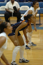
MEAC Volleyball Logo
Monday, November 9, 2009
Interesting Typography
My Workshop teacher showed my class the Rules to fight club last spring. It was so cool that I decided to show some of my favorites.
Rules of Fight Club- http://www.youtube.com/watch?v=fbMa4MGFCOg
Kill Bill(Bang Bang)- http://www.youtube.com/watch?v=9JA4OoG9YA0&feature=related
Family Guy- http://www.youtube.com/watch?v=hb0lIgRD-UU&feature=related
Rules of Fight Club- http://www.youtube.com/watch?v=fbMa4MGFCOg
Kill Bill(Bang Bang)- http://www.youtube.com/watch?v=9JA4OoG9YA0&feature=related
Family Guy- http://www.youtube.com/watch?v=hb0lIgRD-UU&feature=related
Friday, November 6, 2009
Show and Tell- Typography
Monday, November 2, 2009
Searching for shoe inspiration


I have spent countless hours looking for shoe ads to get some type of epiphany on what direction I should take with my campaign. My sister directed me to this site http://www.webdesigncore.com/2009/11/01/30-fantastic-and-fabulous-examples-of-shoes-advertisements/. Here are some of the ads
Subscribe to:
Comments (Atom)


